Rhino Splits
Value: Peer to peer mobile money app for young professionals to exchange funds quickly and easily.
Role: UX/UI Designer
Deliverables: persona, competitor analysis, site map, journey map, wireframe, style guide, interactive prototype, usability testing
Time: February-April 2023
Rhino Splits is a peer-to-peer mobile money application. The user wanted a simple app with no extra features such as social media, investing or budgeting where they could send or receive money with a minimum number of clicks. I produced an app with a clean aesthetic that was simple to use. One of the features the users appreciated most was the ability to pay within a notification. This feature allowed the users to send money to a friend with only three clicks.
Discover and Define
Project Kickoff
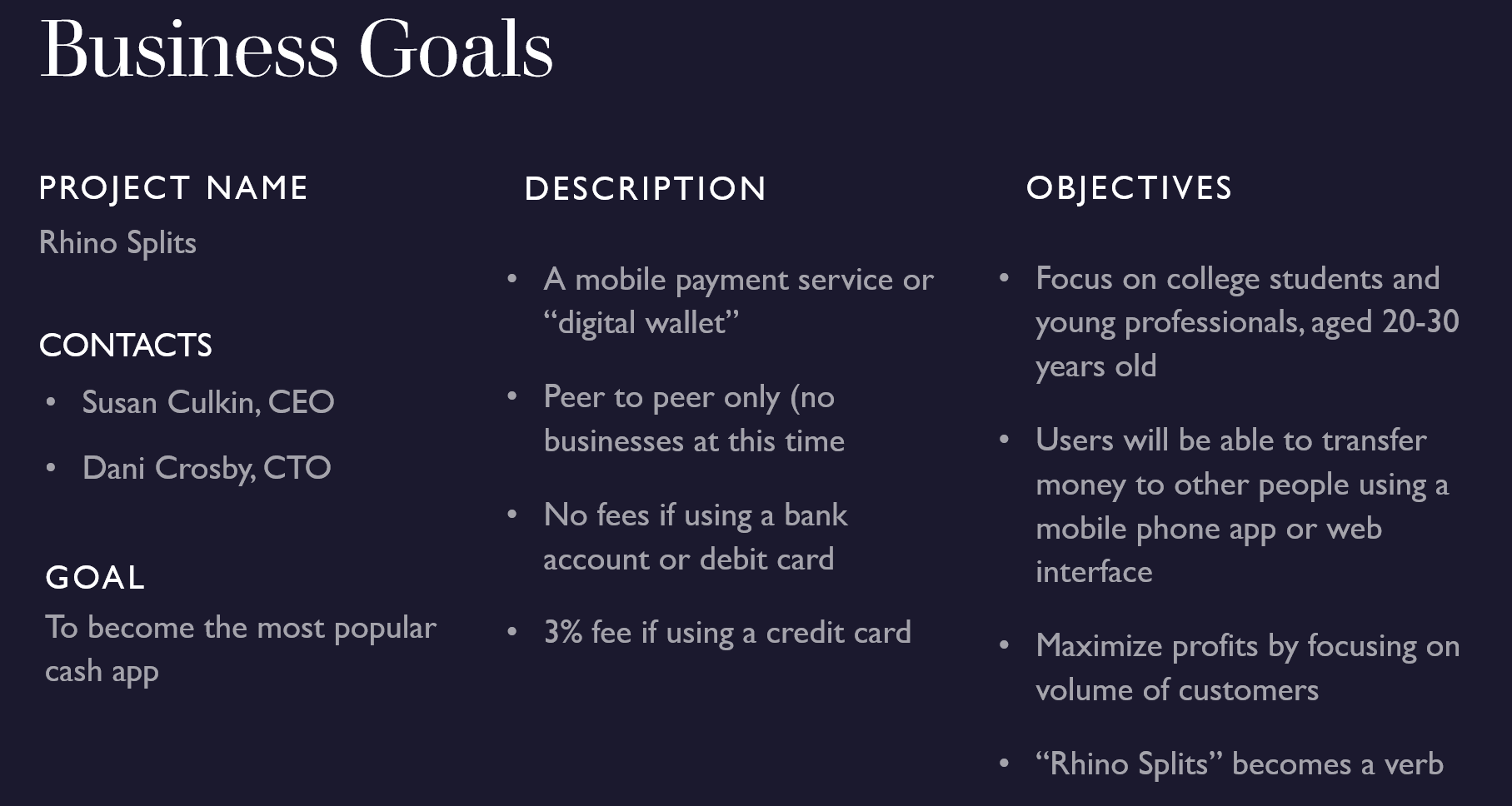
During our Project Kickoff, Susan and Dani set the objectives, constraints and goal for the project; explained our roles and responsibilities and gave us a timeline for the completion of the project. We met as a class and took notes on a Fig Jam board which I then compiled and summarized in a later presentation.
Problem Statement
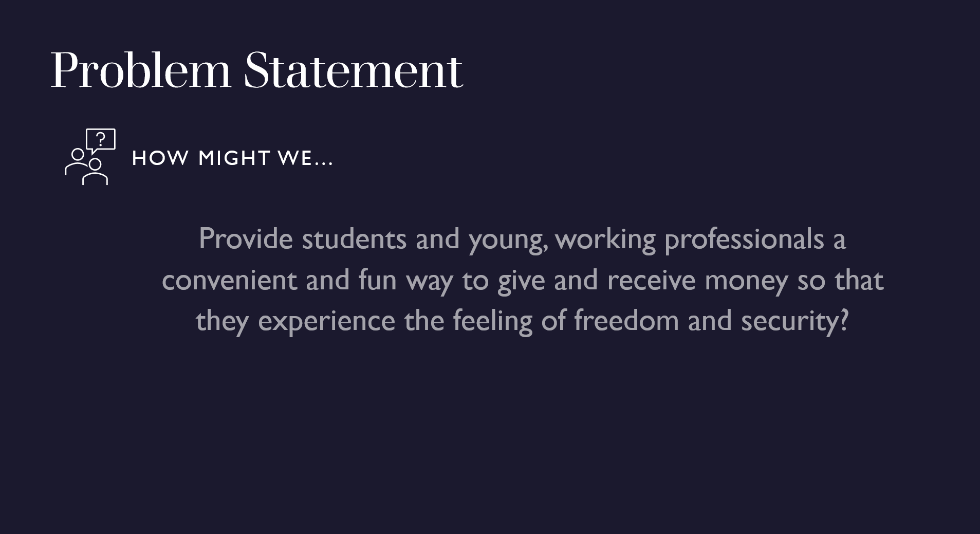
After the Project Kickoff I framed the problem using IDEO’s How Might We method.
Competitor Analysis
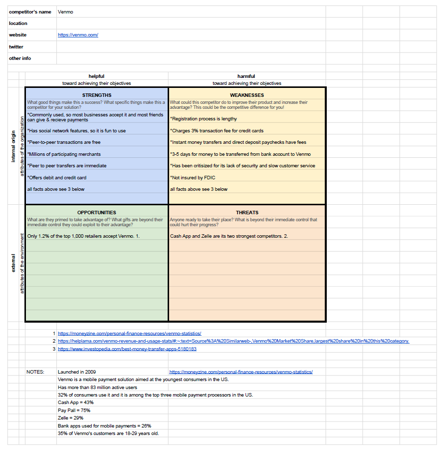
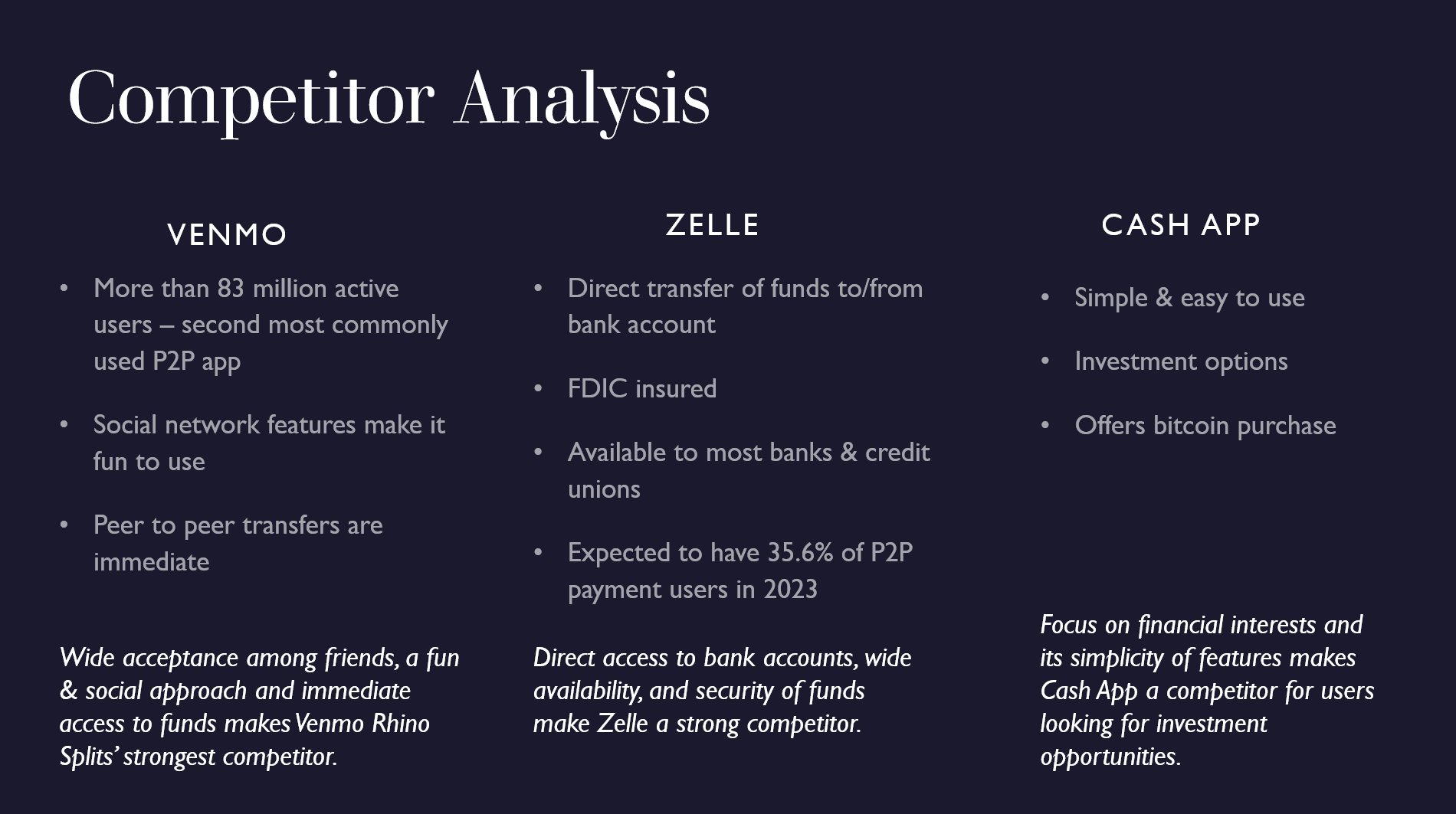
I performed a SWOT (Strengths, Weaknesses, Opportunities, Threats) competitor evaluation to learn about our chief competitors, Venmo, Zelle and Cash App. At this stage, my research was pretty broad. I looked at what features they offered, who their target users were and their market share. I found it interesting to see how each app differentiated themselves, focusing on different features, in the hopes of attracting users. This process also gave me ideas as to what to ask my users during interviews to see what they valued and wanted in an app.
Interview
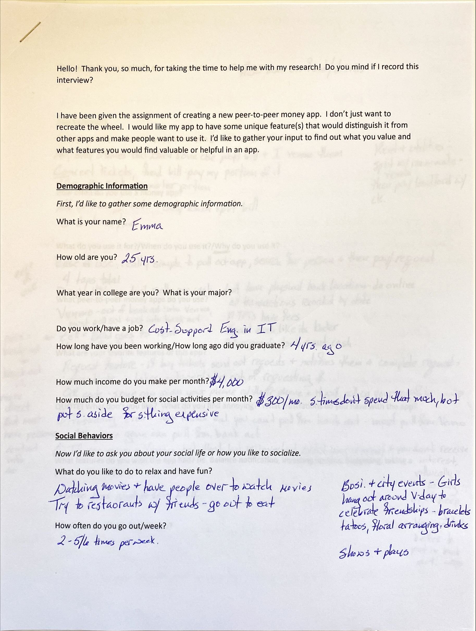
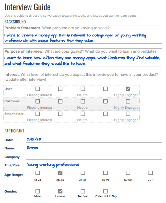
After learning about our chief competitors, it was time to learn about our users. I conducted one-on-one interviews with five people who met our target demographic. I asked questions about demographics, social behaviors, app behaviors and social media behaviors.
From writing my interview questions to summarizing my findings, this was, by far, my favorite part of the design process. I had so much fun interviewing my target users and it was so fascinating to hear their responses to my questions. I learned so much! For example, at this time, I was planning on including several social media features in my app as I thought social media was very prevalent among this age group. However, through my interviews, I learned that they felt strongly that they did not want social media features. They found them ridiculous and annoying! From many different news sources, I had heard that young people were irresponsible with their money, often using credit cards to drive themselves into debt. I assumed this would characterize my users. During my interviews I found my users to be very responsible with money, budgeting, investing and saving.
Persona
From the information I gained from my interviews I was able to create a persona that reflected the characteristics of our users. It was at this point that I decided to focus on young professionals, as I had learned during the interview process that college students were not using money apps often.
Affinity Clustering
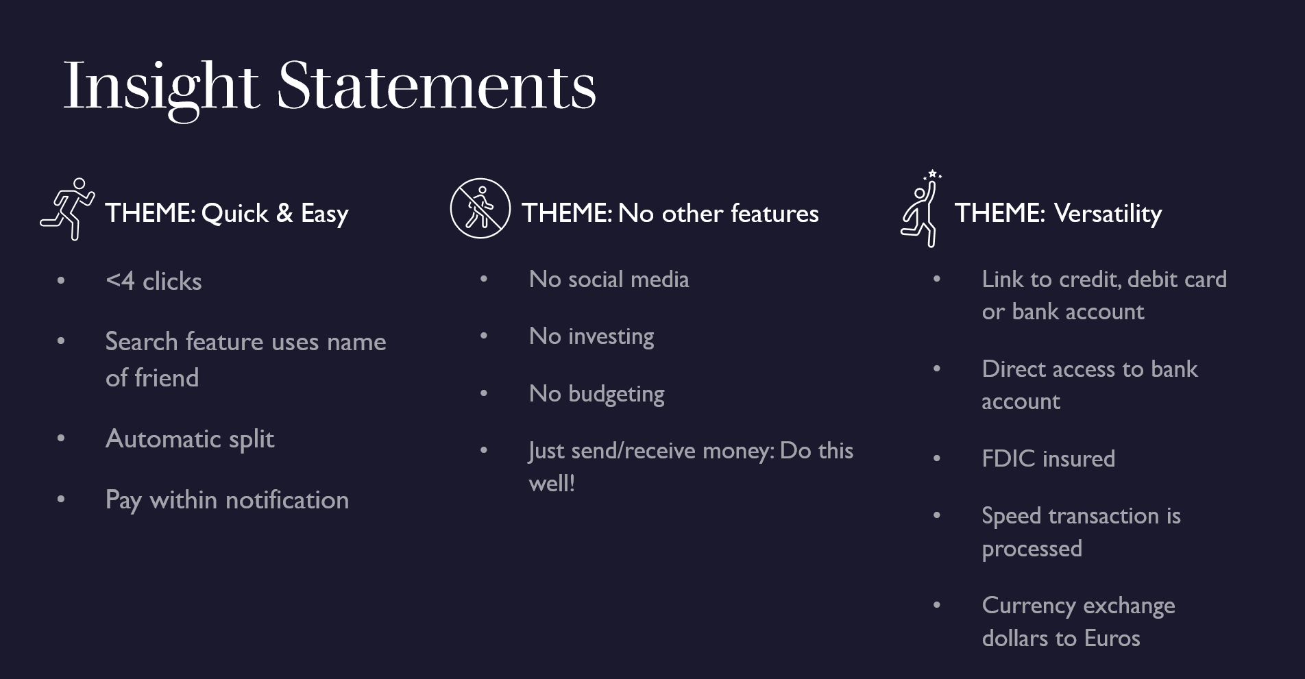
I took all of the information from my interviews and placed it in a Fig Jam board. I looked for common themes. I found three themes that were important to my users: They wanted the app to be quick and easy, they wanted a simple app with no other features and they wanted versatility in the app where they could choose between debit or credit cards or direct access to their bank account. It was fascinating to see patterns in behaviors and preferences appear. Under each theme I listed my insights which would lead to specific features in my app design.
Scenarios
It was time to translate these themes into scenarios.
Journey Maps
From these scenarios I created journey maps. Although I had my scenarios written, I struggled to create the journey maps. I had never used a money app, so it was difficult to imagine specific steps and actions that a user would take.
Site Map
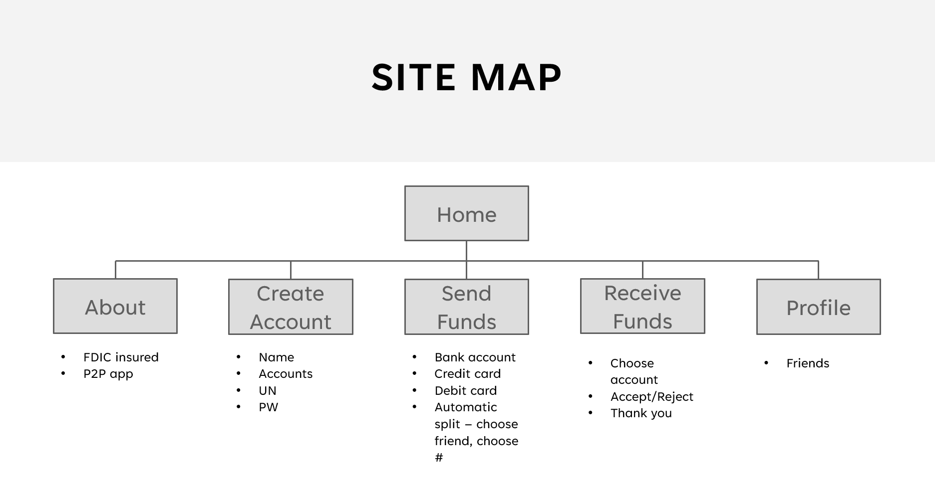
I really struggled with designing the site map. I had never seen or used a money app before. I thought of websites I had used and tried organizing my app according to those sites. I also asked others for feedback. They were happy to make suggestions but differed in their opinions. Because I did not get a firm site map designed at this point, I had to think through the process again when I created my wireframe.
Design
Style Guide
General Information
I designed my phone app to be used on a 390X844 pixel phone screen since this is the most commonly used size in the US. I kept all of my buttons, input fields and navigation in the thumb zone for both left and right handedness. I used a label in the top bar so users knew where they were in the flow at all times, and I kept a wide space between each line of text to make sure users could easily read each line and to allow for tapping space.
Typography
I used only two typefaces in my app, I used Ubuntu for the logo and slogan because I wanted a heavy font that reflected the strength associated with a rhino. I used Open Sans for all other text because it is a simple, sans serif font that is easy to read.
Colors
In keeping with a simple design I used very few colors. I used a deep blue which relays strength and power and orange as an accent color which has a high contrast to the blue.
Found on Canva.com
Wireframe
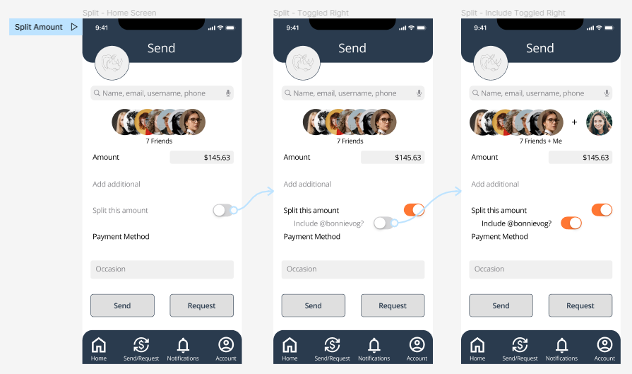
I created a wireframe in Figma. Below are the three actionable scenarios. This process called for a lot of critical thinking! I carefully thought through each step and action a user would take. I had never used Figma before, so there was a sharp learning curve for that, as well.
Scenario
As a young, money-conscious professional, when I need to split a bill among multiple friends, I want the app to split the total of the bill automatically by the number of friends owed, so I can notify my friends quickly and easily with a minimum number of clicks.
Scenario
As a young, money-conscious professional, when I need to withdraw or deposit money, I want versatility, so I can choose between my credit card, debit card or bank account.
Scenario
As a young, money-conscious professional, when a friend requests payment, I want to receive a notification, and have the ability to pay within that notification, so I can pay my friend quickly and easily with only one click.
Prototype
From the wireframe, I made my prototype. I was surprised to find that I continued to make changes to the design. During both wireframing and prototyping, I asked my users for feedback and input. This greatly helped me with my design.
To interact with Rhino Splits and experience it’s complete functionality, please press play.
Discover
Usability Testing
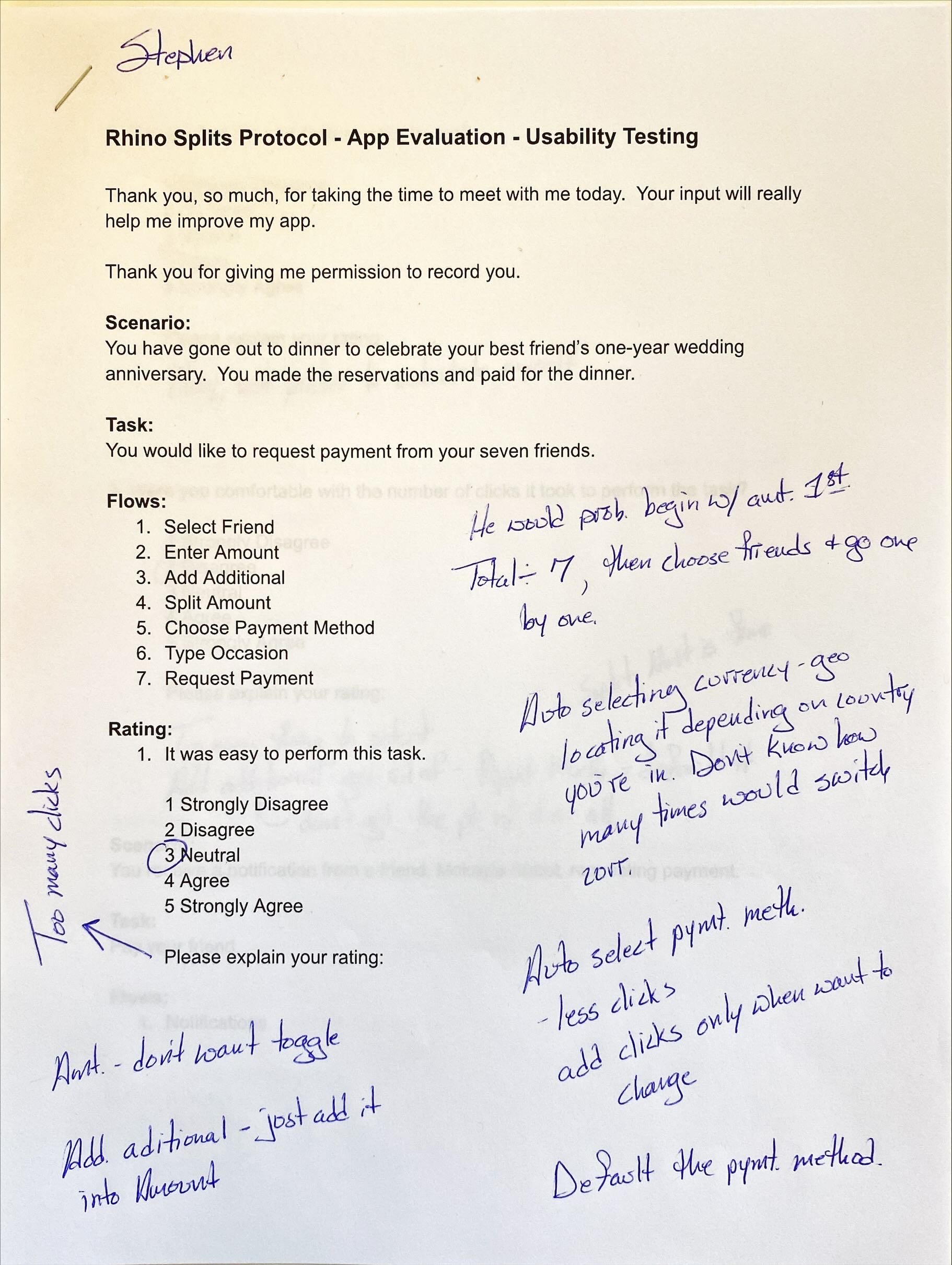
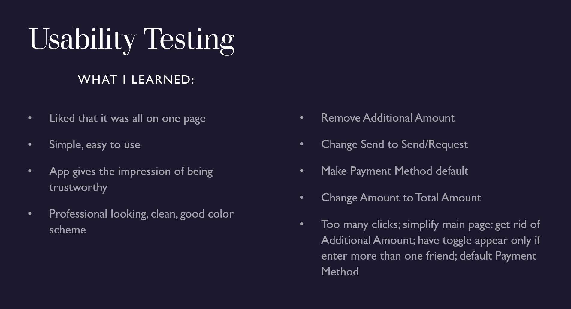
I interviewed several users to get feedback and insight into the design and functionality of my app. Just as in the Discover Phase, I really enjoyed interviewing my users. It was interesting to listen to their thought process as they clicked through each flow. They were very candid and gave me great advice on how to make the app better.
Next Steps
In the future, I would like to make the changes my users recommended. After the changes are made I would like to test the app again to see if the changes made the app easier to use. I would also like to test the other flows that I created in the prototype.
Lessons Learned
I learned so much through this case study! Most importantly:
Design is an evolving process. No matter how carefully and systematically I thought things through, I made changes to my wireframe and prototype.
Get user input throughout the Design Process, not just during interviews and testing. I saved time and gained valuable insights by asking questions and getting input from my users during each phase of the process.
User feedback is invaluable. My users continually told me things I never would have thought of myself and confirmed things that I suspected.
I had never seen or used a peer-to-peer money app before this case study. When this exercise was assigned, I didn’t think I would be able to do it. I found that, through a lot of research, and many conversations with my users, that I was able to create something useful.
Little mistakes can make big problems. When creating my prototype, I put Send in the top bar. I meant to change it to Send/Request but forgot. During usability testing every user became confused when it was time to click the Request button. The top bar said “Send”, but they were requesting payment. There were two buttons with both choices: Send and Request. After an explanation, they understood what to do, but it was a big lesson for me that the smallest details are important!
Do contrast and accessibility testing at the outset of the design. I jumped into choosing colors and designing my app. When I tested the color contrast at the end of my process, I found that the blue text on my orange buttons was rated “poor”. It can be fixed, but it’s much more difficult to fix it now that the prototype is completely built.


