Newsela Website Redesign
Value: Website redesign to improve the user’s experience of a B2B website
Role: UX/UI Designer
Deliverables: asset and component library, style guide, interactive prototype
Time: May-June 2023
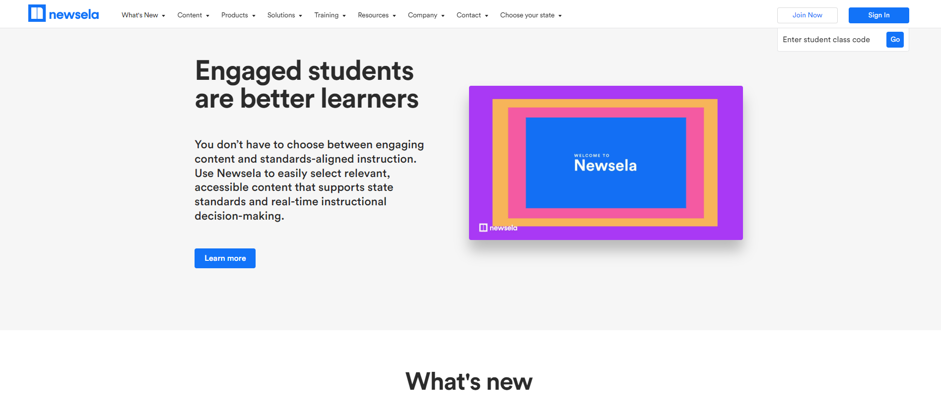
In this case study I built a prototype in Figma to recreate the Newsela website. The goals of this project were to master Figma components, including auto layout, and look for opportunities to improve the user experience. This prototype includes form fields, site navigation and footer, imagery and allows users to interact with the components.
Design
The first step in this case study was to choose a website. I chose Newsela.com since it was integrated into our curriculum when I was a teacher. I thought the information architecture of the website was logical and well organized. The website also had many of the features required for my case study, making it a good fit for this project.
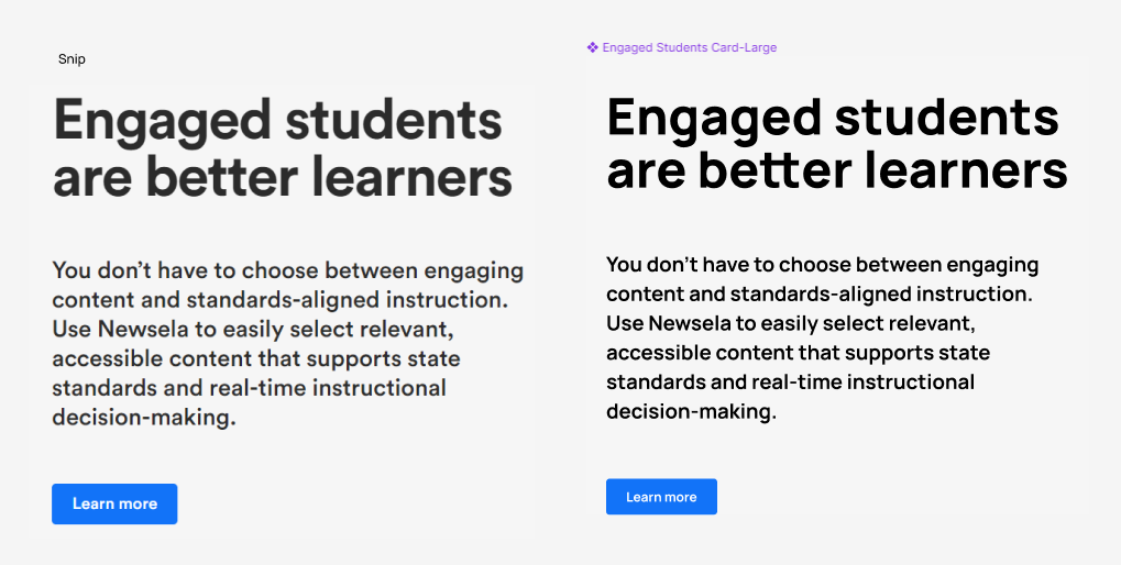
I began with studying the design of the website so that I could replicate it. I chose a 1920X1080 pixel frame because, according to Global Stats, this is the most commonly used sized desktop in the US and worldwide. I used dev tools to find the font and colors that were used. The creators of the website used Circular as the font. Because I did not have access to that font, I searched for a similar one and used Manrope. For the Newsela logo I used Poppins, bold, 25. I was able to identify the colors used on the website by using the eye dropper tool in the color picker.
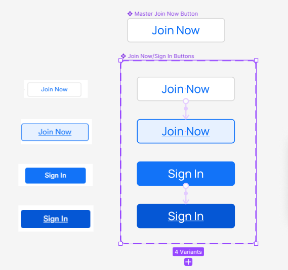
The next step was to begin building components. I looked through the website for patterns. I then made buttons and cards into components with variants. I used the variants to prototype animations.
I broke the webpage into sections and began building them out, using the component library I had created. Recreating the functionality of the web pages allowed me to focus on Figma’s best practices for prototyping such as variants for component management.
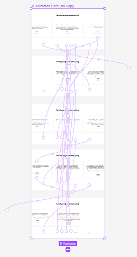
One of the most challenging sections to build was the “What your peers are saying” reviews section. This section contained a carousel that could be navigated by both clicking and dragging the review cards, by clicking the forward and back buttons and by clicking on the pagination dashes. I made sure the heading, “See All Case Studies” button, cards, forward/back buttons and dashes were all in the same place so that when scrolling none of the elements “jumped” or changed position. I made sure the auto layout around each dash was large so that it was easy to click on in prototyping mode. It was challenging to add all of the navigation in prototyping, but it was also a lot of fun and very satisfying when completed.
Re-Design
I redesigned the “Making great content great for classrooms” section of the home page. This section contained a heading, subheadings in a banner with forward and next buttons, five buttons along the left margin each with hover and click states and images. I thought it was busy – the eye didn’t know where to land- and the navigation was confusing. I redesigned it to follow the formatting of the “What’s new” section in order to make it simpler and to add continuity.
I also cleaned up the form fields that were in the section called “The best lessons start with the best content”. They were not evenly spaced which I thought looked sloppy. When I recreated this section, I used auto layout to evenly space each form field.
Additional Changes
I found that the website lacked continuity. There were different hover states for the buttons and sometimes, no hover state at all. Sometimes each word on the button would be capitalized, sometimes only the first word would be capitalized. Sometimes the dashes could be used to scroll, but other times not. Sometimes a back button would be greyed out if the user was on the first image, other times it stayed in its default state. I would redesign the website so that the buttons were consistent. I would also simplify the navigation. For example, the buttons in the Featured Solutions section have two hover states: an overall button hover state where the text is underlined and another where the Learn More text becomes a blue button. I would simplify it to just one hover state, removing the Learn More button. Finally, I would make sure all of the grammar was correct on the site. I would follow traditional capitalization rules where headings were concerned and make sure proper comma usage was followed in the body text.
Newsela Redesign Prototype
What I Learned:
Auto layout – I used auto layout in everything I created for this website redesign.
Components & variants: how to create components and variants of different component states, how to change between variants, and how to prototype using variants.
I created a working drop-down menu and carousel.
I used browser dev tools and page source information to source images, icons, fonts and colors.
I used sections to organize my workspace and components. Originally, I had a page for all of my components, but as the workspace grew, I was finding it harder and harder to find the components I needed in the Assets field. I then created color coded sections for each page of the website. I kept the components used on that page in the section. I kept buttons that were used site wide in a general section. Once I organized my components in this way I was able to quickly and easily find them in Assets, or I could locate them right in the section where I was working.
I paid attention to small details. I made sure each heading, button, etc. was in the same location in each variant so there was no jumping during navigation. I made the font sizes for headings and paragraphs and button sizes, colors, borders and their corner radius true to the original website.
Next Steps
I would like to challenge myself with a complete logo and style redesign. I would also like to make additional pages and prototype the navigation between those pages.


